Pathway User Test

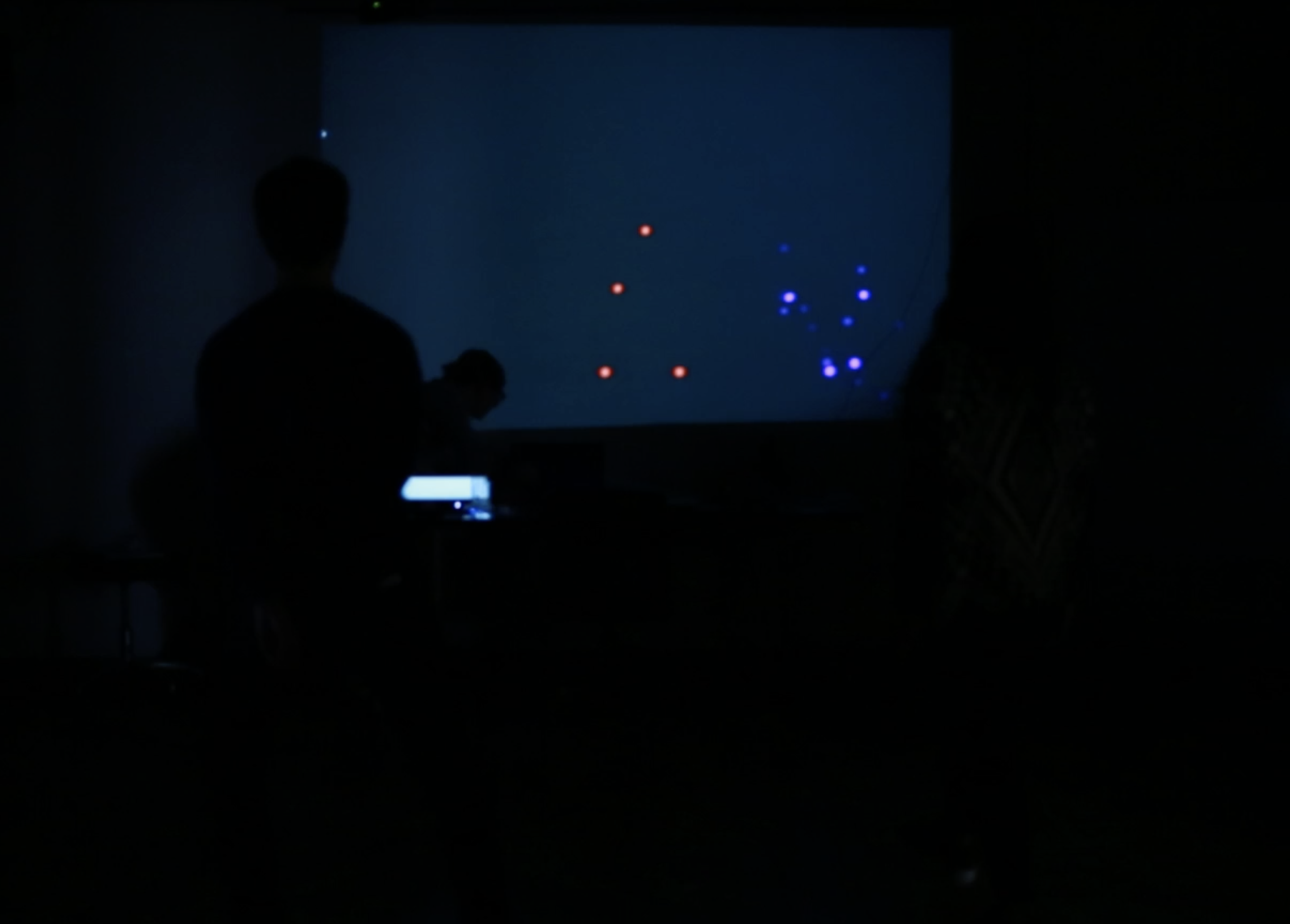
PATHWAYS We witnessed some circular movements when users were trying to identify themselves on the pathway, and some linear movements when they were trying to make connections to each other. There also were some noisy pathways when the users were getting closer to each other to create a line together as well as when moving to and from the projection on the front screen. Moreover, they used outward and expansive movement; their limbs moved away from their centers. In the meantime, the users always faced the projection on the front screen. They bumped into each other because they didn’t look side to side but used the dots on the screen to figure out where their partner was. In terms of space, the users didn’t explore the whole area of the classroom yet created a space between bodies and within their own body. At the beginning, they stood and moved parallel to the screen. After realizing they could make connections with a line, the users started using the depth of the space. Additionally, There was a rhythm to the users’ movements. They were moving quickly to identify themselves at first, and then they were slowing down to find a pose and make a connection. Once the connection was achieved with a line, they moved quickly again to make new lines.
EXPECTATIONS We expected the user to do more exploration of depth and space and some degree of unison between the partners, but that wasn’t always the case. Therefore when the first group naturally try to connect with each other at different depth we were very excited. However there are some unexpected things happened during the test. We expected user to also play with the screen when not making connections, but the activity became purely about making the lines between each other and they didn’t really move around the space, more just moved their body from a stationary position. We also did not expect user to not look at each other when they are making the connection bezier with each other, and no one realized that the control points of the bezier curves were their other hands and feet. We played a song during the second user test, and the user did not respond to the music, they just purely focused on the screen.
DESIGN DECISIONS To encourage our users to move their hands and feet, we tracked pulsing circles with these joints. When they users were within a certain distance of each other, the pulsing stopped and was replaced by a bezier curve connected between the users hands and feet. We made this distance quite small as we wanted people to move closer and closer together, hopefully eventually treating themselves as a single, combined body. Since we imagined our experience to be engaged by two bodies, we didn’t account for - or create a design scenario - when there was either more or less than the two skeletons. Additionally, we specified different colors for the skeleton but used random() for each of the RGB values, so occasionally the two skeletons were close in color and it became difficult to distinguish between them. Furthermore, we did not thoroughly design the quality of the line between people; we simply went with our first instinct of a thin white curve. Lastly, we didn’t thoroughly explore connecting different joints beyond their hands and feet. Fortunately, connecting the feet caused people to experiment with their balance and center of gravity!
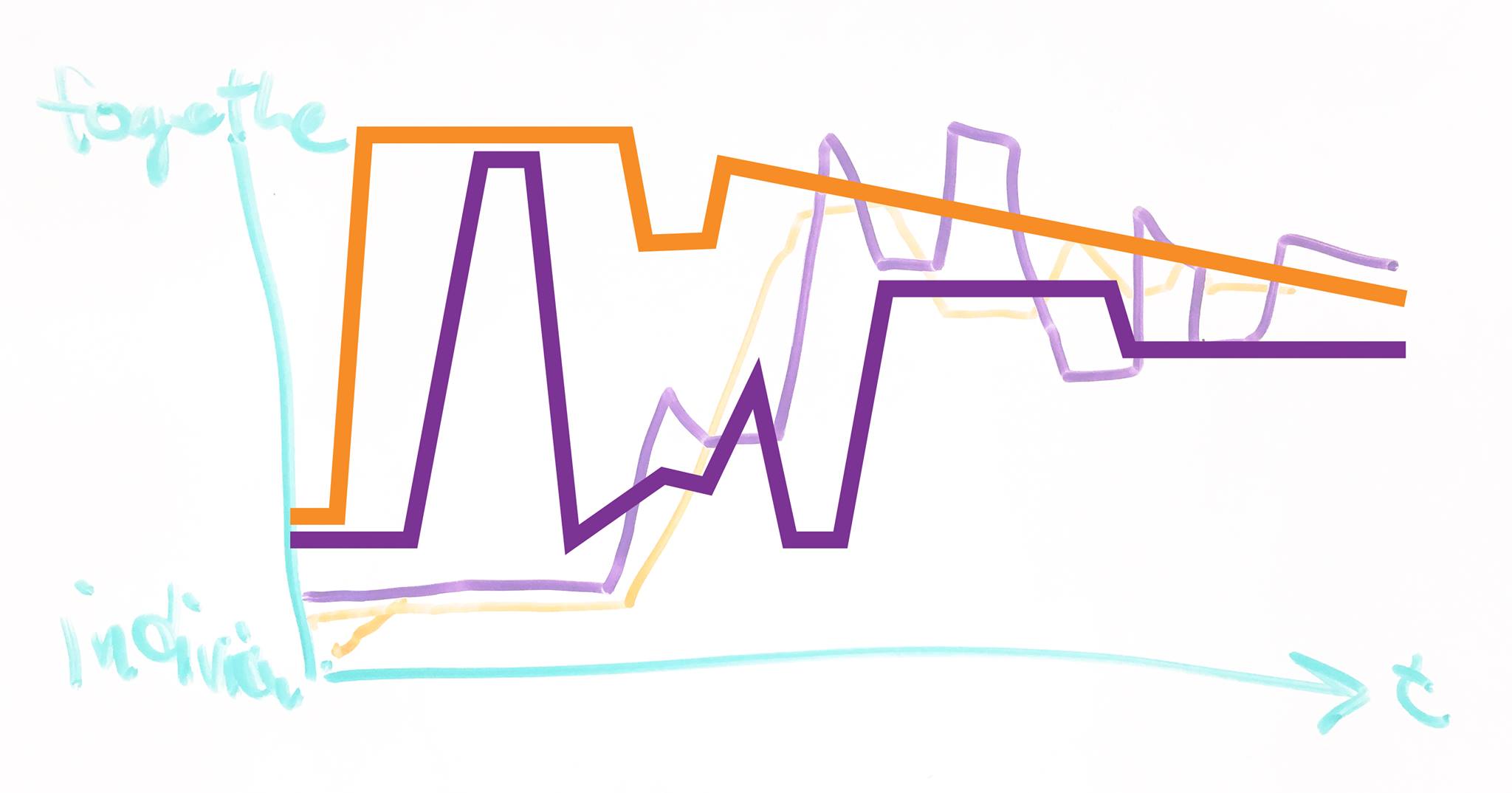
Here’s the comparison of the before and after diagram:
BEFORE:
AFTER:

And the link to the code is here: https://github.com/chloechanggao/chloechanggao.github.io/tree/master/code/itp/S17/PATHWAY-01